Hi, I'm James Ning
Current Master of Information Management and Systems(MIMS) student at UC Berkeley. BS Statistics/Economics from the University of Toronto. Previous experiences include: PwC, business analyst for internal products used by 15,000+ employees across the East Asia region. Toctou, product manager for a gig economy app launched in 2021.Drawing from my experiences in design, art, programming, and product management, I am passionate about creating accessible products for future workplaces.Contact: [email protected]
PORTFOLIO

Designing a better service experience | PwC
Managed full product lifecycle to launch internal service system responsible for handling 100k+ ticket requests per year across China and Hong Kong.

Measuring our environmental impact | PwC
Urging employees to be environmentally aware through a gamified application that calculates personal carbon emissions and encourages sustainable actions.
Gig economy + social media | Toctou
Launched a mobile social media + gig economy platform for freelancers of various fields to discover leads, create network, and share knowledge.
Whichbirb: minigame for bird enthusiasts | Personal project
Designed and programmed bird species sorter to raise conservation awareness, utilizing Nuxt.js, TailwindCSS, Vercel, and MongoDB.
ART


ITSM System and Employee Service Portal | PwC
Project brief:
PwC's IT Service Management (ITSM) system handles firm-wide IT employee operations including IT service inquiry, incident tracking and management, employee IT setup and onboarding, and phishing and security monitoring etc. Its development replaced multiple individual legacy systems, introduced various task automation, and improved user workflow. Along with the Employee Service Portal, designed to receive IT service requests, two new applications were designed and developed. Currently in use by employees daily.
Company:
PricewaterhouseCoopers China
My roles:
ITSM: Product management, project management, UI design, interaction design, business analysis
Service Portal: UI design, interaction design, business analysis
Tools I used:
Azure DevOps board, Figma, Python
Project background
Inside large-scale companies, one of the crucial aspects of managing their day-to-day operations is handling IT tickets and inquiries from employees. These could range from a simple question about a department's contact number to requiring immediate technical support for PC issues. Also considered as support tickets are standard tasks such as the laptop setup process when a new employee joins, or routine tasks such as issuing software upgrade notices when new versions become available. For PwC, the 100,000+ tickets per year make up the bulk of IT service specialists' workload.The goal set by the management team is to create a new system to improve upon the current one. Due to regulation concerns, vendor options were not considered.
My discovery process
As the business analyst, I focused on understanding the elements of an efficient and user-friendly service system, and approached the project discovery process from a few angles: 1. Understand the current ticket workflow and the technical aspects required for core feature migration. 2. Survey the upstream/downstream applications, understand where data come from, and discover potential integrations. 3. Research the ITSM product market, and explore features and methods of interaction that we could adopt.I set up meetings with multiple IT specialists to understand their current workflows for various types of tasks. This process helped me discover many areas for improvement:
First, employee's existing workflows were spread across multiple in-house applications. Lack of data syncing led to repeated data entries, where employees were often required to "mark as complete" twice in two different places.
Second, I observed that many routine tasks require manual operations. To service certain reccurring tickets such as "XYZ device not working", IT specialists would need to reach into their personal notepad to copy and paste resolution instructions.
Third, although core users were accustomed to the designs of the legacy system, many would express their desire for lower navigation complexity. I noticed interaction flaws such as heavily nested menus, elements belonging to inappropriate categorical hierarchies, and flat information layouts requiring excessive scrolling. Due to the information-dense nature of the application, I am also aware of the challenge of maintaining information clarity without oversimplifying.
Finally, performance issues impacted users' working efficiency. Webpage loading times are below consumer application standards, and solving them became both a technical and UX consideration for the new system.I also surveyed various products such as ServiceNow, Atlassian Jira Service Management, Incident.io etc. I collected insights on the different solutions each ITSM service provided, for example: Jira offered a comprehensive solution with a focus on end user ticket collection, whereas Incident.io primarily targeted incident management and response.
The solutions - ITSM system
Over the course of 1 month, I presented my learnings and draft UI designs to stakeholders. Taking the role of a product manager, I urged to take an iterative approach to development due to the product's complexity, evolving functionality, and our desire to create a product focused on user feedback. The initial version will be an MVP that defines core features, system architecture, and data structures considered for legacy system data migration. I drafted a set of semi-technical project documentation for the purpose of migration, including access control matrixes, data types and interactions for each input field within ticket forms, and details for all triggered events on button click, etc.Despite having in-house UI designers, I took charge of the complete product and UI design as a result of my strong design capabilities and direct involvement with both the business stakeholders and developers. My goal is to deliver a product that is pleasant and intuitive to use, especially when core users will depend on it for upwards of 8 hours a day. In my designs spanning across 100+ pages of Figma pages, I addressed the aforementioned issues with interaction complexity. Aware that each design decision should be intentional, some improvements include:
- Employing icons and tooltips to improve visual clarity
- Utilizing fixed nav bar for scroll-heavy pages
- Using consistent interaction/micro-interaction behavior and wording across the application
- Defining branding-compliant components, standardized spacing, color, and fonts etc.


Stepping into the role of a project manager, I led the development efforts since the project initiation to its current stage for over 2 years. During this time, I paid close attention to improving the ways our team collaborates. In past projects, information is often only available by request as documents are saved locally and exchanged through email; Additional project communication, such as requirement change and bug reports, is passed through multiple rounds between end users and developers. To improve information symmetry and encourage software iteration, I learned about the agile framework and implemented it into our development process.I onboarded the development team to follow a two-week sprint structure, reducing release time to once every one or two sprints. Frequent releases made features quickly testable and usable. Requirements were broken down into “Tasks” containing technical information relevant to developers, and “User Stories” containing ideas understood by users. Using the Azure DevOps project board, information was displayed visually to both users and developers, allowing for symmetric and up-to-date project information. Since the project involves internal users working in IT, inviting users to directly contribute feedback on features and bugs to the system also improved communication. All parties became actively involved in the feedback/documentation process, as a result of the reduced cost of communication and increased benefits through information visual clarity.
The outcomes - ITSM system
The MVP version of the ITSM system was launched after 3 months of development, and the team is currently working on its 7th major release. The current version is a robust high-availability system capable of handling over 100k+ tickets a year, used by hundreds of IT specialists daily. We addressed issues with automation and integration raised during the discovery process as well as other feature improvements. The redesigned system architecture also greatly improved loading times and request errors. The system is currently one of two core projects for our department for its consistent value delivery in improving employee working efficiency.The team launched a user survey feature to receive direct feedback from end users, with a current user satisfaction rate of 98%. Tickets with low satisfaction rates are automatically flagged and the corresponding specialist will be notified to reach out to users within 24 hours.I also designed and led the development of an instant message reminder/notification feature within the web application that allowed specialists to track items that required further actions.In addition to improvements in interaction patterns, the current ITSM system offers greatly improved user interface and design consistency. Because of my role as the UI designer in conjunction with managing the product, I was able to communicate directly with frontend developers to raise development standards, and adhere closely to branding guidelines. My experience in HTML, CSS, and Javascript also allowed for effective technical communications.
The solutions - Employee Service Portal
While the ITSM system will improve working efficiency for IT specialists, I also believe that it is important to deliver a fluid user experience for employees seeking IT help and looking to submit tickets.To get a better idea of what we can do to make things easier, I analyzed the search data of various internal platforms to see what questions users typically ask. As it turns out, many instances of such information search can be categorized as some form of "FAQ" - repeatedly asked questions that can usually be answered within one or two lines (either by directly answering the question or redirecting to a document containing the guides). For example, the most common questions are related to setting up mobile access to company sites. For various reasons, this process might currently take users multiple steps to get to, assuming users know where to look.

I drafted the design for a dedicated FAQ portal to reduce the cost of knowledge searching. Based on the categories of inquiries, a quick glance at the page should allow most users to find what they need. The search bar provides global search for all FAQ documents. The service portal serves to decrease common inquiries and reduce workload for IT specialists. Remaining inquiries would be directed to a page where users can then submit service tickets.I presented my designs and rationale to the management team. The team liked the idea and went through a few rounds of discussion with directors. Eventually, management chose to prioritize improving the experience of the ticket submission process, and as a result, I was tasked to create alternative designs for a Service Ticket Form Portal.
The outcomes - Employee Service Portal
In my designs, I noted a few features: Recommendation of commonly used form templates, similar to displaying FAQs by frequency; A "Favorites" section for users with a need to repeatedly fill out a particular form.The designs I created below were eventually launched by other development teams and is currently in production.


Carbon calculator application | PwC
Project brief:
Carbon neutrality initiative aimed towards engaging employees to reduce personal carbon output. Users can calculate their approximate personal carbon emissions through an interactive quiz, compare results against others, and reduce emissions through a voluntary pledge-making process. Launched in 2022 and engaged ~3000 employees to estimate the carbon output of their daily activities.
Company:
PricewaterhouseCoopers China
My roles:
Product management, project management, UI design, interaction design, business analysis
Tools I used:
Figma, Yuque, Microsoft Suite
Project background
The global temperatures are rising. The evidence is clear - heat-trapping greenhouse gases are the culprits. Modern corporations are required to attend to the social responsibility of reducing their operational emissions. Companies typically achieve this by building greener offices, reducing employee air travel, or other ways of offsetting carbon such as initiatives to plant trees and seagrasses.However, many companies often do not act on reducing emissions originating from their employees' personal daily activities, as those numbers don't typically account for the carbon neutrality goal of the organizations themselves. The ESG team at PwC chose to create an application to tackle this often overlooked aspect of corporate social responsibility.
The solutions
When I was given the goal to design a product that raises the environmental awareness of PwC employees, my biggest question was: If participation isn't necessary, how can I make it engaging enough for people to want to try it out?For me, gamification was a compelling answer to that question. The project had to be exciting enough for the users to enjoy learning about their own environmental impact. Playing around with the application could hopefully feel like a breath of fresh air during a busy work day. And bonus points if it could convince them to share their results with each other.After researching, and browsing through various products made by NGOs such as WWF and other companies, a carbon calculator application fits the criteria nicely. I determined that the UI needed to engage with users in a fun and lighthearted way. It also should visually distinguish itself from other types of internal applications to avoid association with applications such as mandatory employee training. I chose to pitch to the ESG team the idea of a quiz along with presenting a medium definition UI. I also included various alternative ideas to engage the team in brainstorming. The team quickly greenlit the idea and we went to execution.Throughout the process, I worked extensively with the ESG team to come up with the most fitting questions to calculate one's personal carbon emissions, and crunched the numbers so that each question would generate a specific carbon output number. We also divided the quiz into 3 sections: food, lifestyle, and transportation. The users would be able to understand which aspect of their life is leading to the most carbon emissions. Finally, we are able to display the numerical results as their carbon equivalents (e.g. # of trees needed to absorb) so that the data can be meaningful. We also brainstormed a social sharing photo wall where users can upload their own images showcasing their own environmentally aware actions.As the designer, I utilized large illustrations, colorful visuals, and various methods of data presentation. After finishing the quiz, the website will use a call to action to directly lead users in making their first pledge. Despite its drastically different look from other PwC applications, I designed it with careful consideration of the branding guidelines. The branding team praised the mockup for its "one-of-a-kind" visual appeal, and we were able to proceed with the application development. (the branding team did not allow the use of rounded corners, unfortunately)I managed the application development with a team of 2 engineers, facilitated communications, and set deliverables with the ESG team, and we launched the application in about 3 months.


The outcomes
The application launched within the China and Hong Kong region, and engaged with nearly 3000 employees to calculate their personal carbon emissions. With its pledge-making feature, employees voluntarily promised to reduce carbon emissions totaling over 1800 tons. PwC Caribbean firm took an interest in adopting the application for their region.
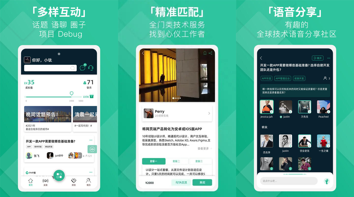
Gig economy + Social media | Toctou
Project brief:
Toctou is a native iOS/Android social platform & gig economy app catered towards freelancing software developers. It connects freelancers to potential businesses/entrepreneurs looking for services such as application development, graphic design, and marketing etc. Users can find potential business opportunities through hosting or joining interactive voice chatrooms. Launched in Sept 2021 on the iOS App Store, Google Play Store, and various android app stores in China.
Company:
Erawork Technologies
My roles:
Product management, project management, interaction design, wireframe design, business analysis, data analysis
Tools I used:
Adobe XD, Adobe Illustrator, Figma, Python, Notion, Yuque

The background
During the COVID pandemic, unprecedented disruptions were brought to the way we work in the form of lockdowns and other social restrictions. For China, its impact was even greater. Eventually, many companies were asking one question: What is the future of work going to look like?It took some time for companies that aren't already remote-first to adjust, but a policy shift towards incorporating certain levels of remote work/WFH seemed inevitable. It is during this time we began experimenting with the concept of building a social media product that connects those who are willing to work remotely, and those who are looking for talent regardless of their locations. We took inspiration from the models of two major products: Clubhouse had a novel social media model, and Fiverr had an established and successful gig economy model. Toctou was designed to be an intersection of the two, aimed towards the post-pandemic Chinese market of software developers, which had few products in the same vertical at the time. I led the product as its product manager, responsible for its market research, wireframing, logo and brand identity design, feature definition, and backlogging, eventually launching its iOS/Android app in 5 months.
The process
During the product initiation phase, I surveyed the products within both the Chinese and international markets for products in the future of work and social media space. I led brainstorming sessions with the startup founders, and two products caught our eye: Fiverr and Clubhouse. We settled on creating an application intersecting the two products.The feature discovery process involved blackboard brainstorming sessions over the course of 1 month. We discussed how the social media aspect should act as a method of user acquisition, complementing the core monetization features of the app, that being the gig economy marketplace. I introduced the idea of "user personas" to the team and led the blackboard session of defining a buyer and a seller persona respectively.The app design went through a hierarchical process, starting from defining feature modules to designing detailed user interactions. I created over 150 pages of wireframe drafts based on our brainstorming diagrams. To track how the information displayed relates to each other, I created a mind map to illustrate the interactions between every piece of data displayed. This was a helpful reference document for the development process. I also created detailed documentation for gamified features such as user levels, and monetization rules based on the price of cost of operation (ie. price of Voice over Internet Protocol services). The process however critically lacked user research phases involving direct interviews/communications with potential users.


I proposed the name Toctou, in reference to the race condition bug TOCTOU (time-of-check to time-of-use), and its Chinese name a homophonic translation (“钛客”), also has a tech-related linguistics connotation. I designed its logo after the commonly used double slash (//) in code, indicating a comment. At the same time, "comments" are also the building block of a social media platform. I created Multiple sketches of the logo in Procreate, and finalized its vector version in Adobe Illustrator.

The UI designs were a collaborative effort between an in-house designer and a contractor in Canada. I was responsible for leading design directions and communicating intended interactions. Along with the app UI, the product needed a web landing page that serves to direct users to download the app, for which I created a wireframe for designers to work off of. Both the app and landing page UI were shipped for development in about 1 month time.

The UI designs were a collaborative effort between an in-house designer and a contractor in Canada. I was responsible for leading design directions and communicating intended interactions. Along with the app UI, the product needed a web landing page that serves to direct users to download the app, for which I created a wireframe for designers to work off of. Both the app and landing page UI were shipped for development in about 1 month time.Working with an external development team, I learned about the tech stack for app development, including the popular framework called UniApp in the Chinese market. UniApp utilizes Vue.js to create cross-platform applications. However, due to concerns with its performance, and decreasing community support, we selected the robust native languages for development. I also researched and compared services that will be used to operate the app: Agora for VoIP, Aliyun for servers and databases, and app distribution channels such as Huawei AppGallery which are unique to the Chinese market. Through the process, I learned extensively about the ecosystem surrounding mobile application development and publishing in China.I collaborated with the development team to define MVP features, estimate development stages, set deliverables, and ensure targets were met. The app was completed in under 3 months.
The outcomes
Toctou was launched on major application marketplaces for iOS and Android with its own store pages in Sept 2021.
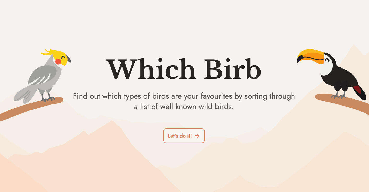
Whichbirb: minigame for bird enthusiasts | Personal project
Project brief:
An online quiz to sort through a list of well-known bird species for birding enthusiasts. This project showcases images of birds only in nature settings and raises awareness of bird species and their conservation status through interactive learning. Completed in Aug 2023.
Tech/Frameworks I used
Nuxt.js, Pinia, MongoDB, TailwindCSS
Tools I used:
Figma, Vercel, GitHub, Visual Studio Code, Unsplash/Wikipedia (for Creative Commons content), Notion

The background
Birds are fantastic creatures: they are essential in the functioning of our ecosystem as pollinators, seed dispersers, scavengers, and more; they hold significance in human culture as symbols of fortune, courage, and inspiration; they are also intelligent and inseparable companions for some. Despite their presence, many of us never had a chance to recognize that the iconic bird calls echoing through breezy summer nights of their childhood belonged to the mourning dove. There are an estimated of over 10000 species of birds in the world, and I hope to create a personal project where people can learn more about the birds that are significant in our culture, and our urban/natural environment.
The process
I approached this project as an opportunity to practice a wide range of skills, including UI design, interaction design, programming, and product sense.At my workplace, the tech stack includes Vue.js and MongoDB. Recognizing the importance of improving my technical communication skills with developers in a product management role, I saw this project as an opportunity to gain hands-on experience with these technology. As a result, I selected MongoDB for the database, and Nuxt 3 as a full-stack framework with Vue.js frontend.Initial designs were created using Figma, the tool I am most familiar with. The goal is to challenge myself to design something fun, colorful, and spacious - but also fully responsive across different platforms.The core sorting algorithm of the quiz format was directly inspired by a project called charasort. It utilizes a merge sort algorithm to determine pairs for comparison, which is unlike most "single elimination" preference sorters, making this style of quiz slightly length but more accurate.The process was not without its challenges, each of which gave me valuable opportunities for growth and learning:Sorting algorithm: The first challenge was to incorporate the merge sort algorithm from the charasort project, which was written in vanilla Javascript into my project. Having little prior experience working with JS, I spent significant effort making sure I understood every line of code during the implementation process.Database integration: I planned to save users' sorting results in a database. Initially I looked to use Firebase Realtime DB, but its limited support for Nuxt 3 proved to be a challenge. Instead, MongoDB was a simpler integration, specifically using Mongo Cloud. I learned create an API route in Nuxt 3 API where it can then connect to MongoDB and register quiz the result using a POST method.Displaying user results: I wanted to design the quiz so users can refresh or close the website without losing their quiz results. This turned out to be the most significant challenge of the project. Through researching, I discovered that quiz results can be saved and persisted across pages using a "local storage" such as Pinia. Without needing users to authenticate, or fetch from the database, this method made it possible for users to come back to their previous results, or restart the quiz.Mobile compatibility: Using TailwindCSS, I learned to create the website under its mobile-first breakpoint system. I fine-tuned the elements for displays such as tablet resolutions, and hid certain elements on smaller screens to avoid excessive information. I also implemented a TailwindCSS-animate library for additional animations.Rendering the "progress circle": Turning a horizontal progress bar into a circle was an interesting challenge. I used CSS vectors to draw the circle, dynamically change based on % of the quiz completed, while maintaining its responsiveness.

The outcomes
I shared the website on social media platforms such as Reddit, Twitter, and Facebook, prompting a few hundred users to complete the quiz (ravens and crows are fan favorites). The website received positive responses from users with many saying that it was very enjoyable to learn about the various kinds of birds, and that the results were accurate. Overall, this project was a tremendously rewarding self-learning experience. The knowledge I gained through solving coding challenges were also greatly helpful towards my ability to communicate technical ideas at work.